Hypertype, 2001
The word "type" actually originates from the Latin typus, which means a figure, image, a form, type, character. Hypertype is about the changing nature of language and how computers influence typography, shaping our perceptions, by adding pictures through a keyboard interface. Will type and even language be able to weather the more image oriented barrage of technological change or will it simply metamorphose into a hybrid? Hypertype lies between the tangible and the ethereal allusive system that produces the characters that rely on the keyboard interface. The mouse and the keypad are the intermediary through touch. Due to developments in voice recognition some people regard the keyboard as a dying input device. But voice recognition will always fail to reproduce its shortcut of a system to translate a character into an image instantaneously and at great speed.
Hypertype consists of 26 light boxes, which are approximately 18.5 cm in height and width. The lightboxes are arranged to emulate computer networks and allude to flowcharting, which is used by programmers and web designers. Flowcharting is also a metaphor for hierarchies and corporate structures. The imagery contained within the lightboxes are comprised of computerized symbols, which in its present computerized incarnation are, called dingbats which were initially created in 1978 by the famous typographer Hermann Zapf. In each lightbox I have a coded message, which references not only specialized language but also encryption and a cult of secrecy, which aided in the development of the computer - just think of the enigma.
The use of a light box alludes to advertising and consumer culture. They mimic the computer screen which has also embraced advertising and commercialism. The cold gray metal the clear water-like surface of the smooth screen the transparent yet ever shifting imagery with its labyrinth of information and tangle of the web are at once present-frozen and ready for examination like an eye chart or x-ray or even a catscan.
Hypertype follows my ASCII show in October of 2000 in its relevance to codification and encryption because it relies on computer hardware and software to translate Unicode into type where every keystroke is assigned a symbol or number of symbols. These dingbats and their arrangements are further codified by a written text that will comment on technology that will be hidden underneath, determining the dingbat symbols portrayed in the light boxes. The evidence of codification will be obvious by repetition and further reference the history of the computer and the cracking of code.
Hypertype typifies the conflicting or adjunct forces of one symbol juxtaposed with one another.
The sequences are varied and pooled from what dingbat fonts that can be found on the web. Hypertype is very much about coping with information and systems using coded shortcuts through structures in computer programming. These systems that a programmer uses are likely modeled off language itself, letters words and sentences become shortcuts for ideas representing objects, actions or time and place.
The development leading up to the dingbat is not quite clear, ornaments in older books scrolls and manuscripts could have been an influence, or letterset symbols, perhaps it goes further back to coats of arms and identification symbols. Its precursors may even be traced back to the pictograph and the ideograph. Dingbats seem to have a greater affinity to eastern or ancient glyph writing traditions because they are not so removed from their original reference point. Unlike glyphs however dingbats are not in anyway ordered enough to be considered a complete language nor do they exhibit a system that has enough variety to speak to a specific event. That is not to say that dingbats do not have the strength to allow complex investigation and association. Dingbats record events, or express messages, by means of pictures representing the actions or circumstances in question, in this way they function as a form of picture writing.
Type, by contrast, is no longer a type when the thing typified comes to be actually exhibited. Also, type; at least in the ancient western tradition, was originally modeled off human proportions that have become abstracted. It is the abstractions of its letterforms, which gives type its plasticity allowing it to flow from one idea to another. In contrast a dingbat is often an intermediary, something that falls between type and literal representation. They are symbols, many of which have lost their meanings. From corporate logos to 1950's kitsch, dingbats borrow from high art, popular culture, consumerism and spiritualism and all must fit within the constraints of the computer keyboard.
With the introduction of CD-ROM typeface and dingbat collections, have moved digital type away from being an expensive, specialized tool, towards becoming a commodity and with the rise of Type Foundries we can see that new fonts, ornaments, dingbats and fontbats are being developed on a daily basis. Much of this is because of the availability of programs such as Fontographer that allows anyone with access to technology to develop a new type or dingbat family with relative ease. Dingbats, beyond a shadow of a doubt, are new forms of expression because they convey information in so many new ways. They are trendy and hip and they change as quickly as slang being added to language. The question is are they changing language and challenging conventionalized forms of representation? What has happened to craft of the typeographer? What is the effect on language and legibility?
Resistor, 2006

Archival Digital Print, 8” x 10”
Echosystem, 2007, Archival Digital Prints, 40” x 44”
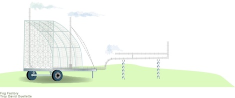
Early Design - Fog Factory, 2006

Archival Digital Print, 18” x 44”
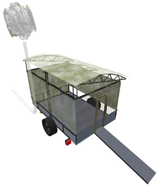
Showing Different Virtual Materials, 2007

Archival Digital Print, 40” x 44”
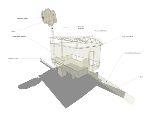
Diagrammatology, 2007

Archival Digital Print, 40” x 44”
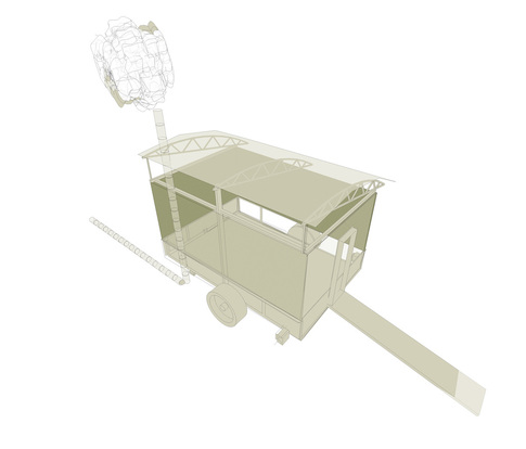
Fog Factory, 2007

Archival Digital Print, 40” x 44”
